The GDP And The Government’s Inflationary Hall of Mirrors

By Aaron Krowne
Founder, ML-Implode.com
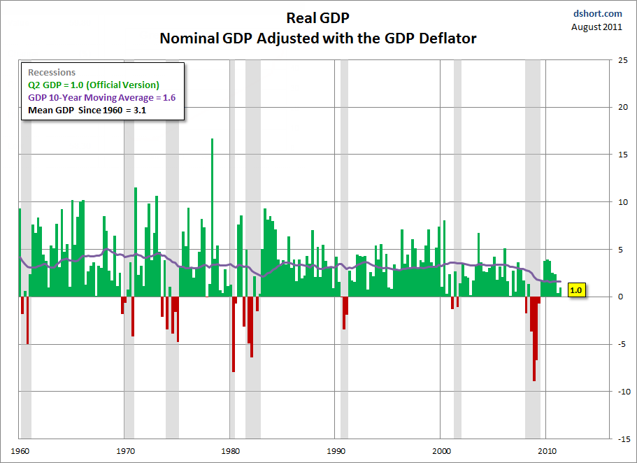
In a recent post, Mish looks at last week’s release of revised GDP data from the BEA, and taking a tip from the Consumer Metrics Institutes’ commentary on that release, is skeptical of the “realness” of even the newly-revised-lower Q2 2011 GDP figure of .98% annualized growth (the original estimate was 1.29%, so the BEA erased a whopping quarter of the growth it originally “saw”).
Mish agrees with Doug Short (as well as the CMI’s Rick Davis), as do I, that the BEA’s GDP estimates are suspect anyways. Besides the sizable downward-revisions in hindsight, a rather more glaring reason is because the BEA uses its own GDP “deflator”, rather than simply using the BLS’s CPI.
(For beginners to these seemingly-arcane contortions, since the GDP just counts the total number of dollars being transacted in the economy, it does not automatically take into account the gradual rise of (inflation in) prices of goods and services, making year-to-year comparisons invalid. But if we “deflate” the GDP by an estimate of how much inflation there was since the previous GDP number, we can get a fair comparison of “real growth”. In theory, of course.)
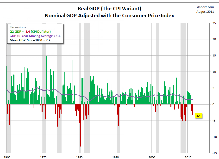
The CPI and the BEA’s deflator differ significantly; enough that the latest quarter’s annual GDP rate would be a very-recessionary -3.4% if the BEA used the CPI (or, if applied just to Q2 2011 and not historically, that quarter’s GDP growth would be just about zero.)
Here are Doug Short’s very helpful charts, and you can clearly see the significance of this difference:

click charts for bigger versions
If negative GDP growth is being used as some sort of guideline for determining whether we are in a recession, this is obviously an important thing to get straight.
Now, the real interesting question, rehashed often on these pages, is whether even the BLS’s CPI is an honest and fair metric of real-world “consumer price inflation.” We think not.
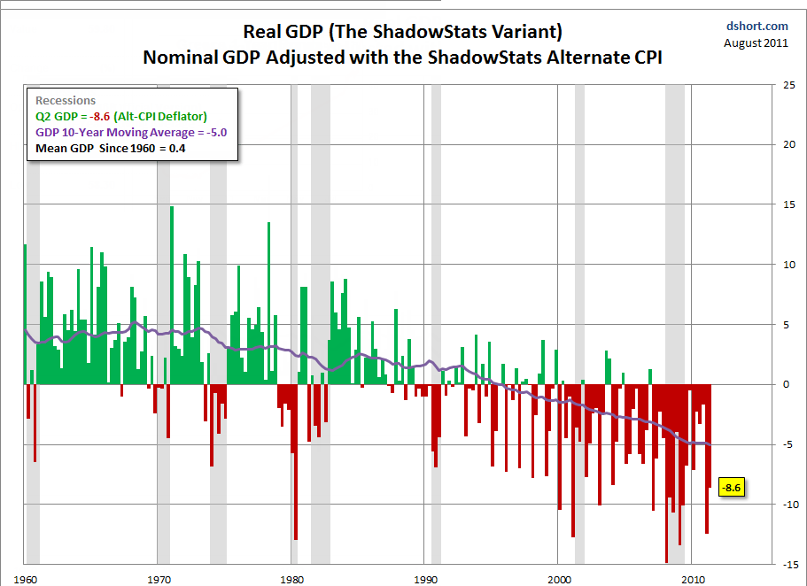
John Williams ponders this question full-time over at ShadowStats.com, and publishes a set of alternate “headline” macro-economic numbers, among them including the “SGS-alternate” CPI. You can read all about it at the site, but in sum, this version of the CPI is more or less what was used before the Clinton administration, which saw a volley of theoretically-dubious changes to the CPI, all made in order to engineer a lower number.
Put another way, all Williams is doing with the SGS-alternate CPI is publishing what would have been officially reported by the government at the beginning of the 1990s. And what does that yield?
Answer: A very, very ugly post-1990 picture.
Here’s where it gets weird: Mish and Doug Short immediately dismiss this result. That’s a little bit odd, because neither have disproven anything about the SGS-alternate CPI methodology. They just dismiss the result out of hand, because it is “too extreme”.
Since I believe the SGS methodology is more sound than the BLS or BEA’s methods, while certainly not perfect, I would unhesitatingly endorse Williams’ numbers as the most correct of the three.
And is that really so odd, given other things we know (and presumably, even Mish and Doug Short would agree to)? Witness:
- We know that earnings/income has been falling consistently, depending on how you measure, since the early 2000s, 1990s, or even 1970s (the latter by the BLS’s own CPI, applied to median individual earnings, not average household)
- We know that the economy has become increasingly “financialized” and less based on real production in the last 2-3 decades.
- We know that wealth has become more concentrated
- We all agree the government consistently lies about economic statistics to paint a picture of its own better performance (which must take an exponential shape when concerning rates of growth)
And that’s just for starters. All of these paint a picture of secular economic decline that started just in the last 2 or 3 decades, and is being suppressed. Sure enough, Williams’ version of the real GDP chart is the only one that agrees with this set of phenomena.
Just to throw in one more qualitative point, how many people can say the economy in the US has “felt” vibrant in the last 20 years, other than during the brief periods of the dot-com and housing bubbles? I certainly can’t. And I’ve visited quite a few (15-20) other countries, so I know what a vibrant economy looks and feels like. And this ain’t it.
Sadly, I think Williams has the right picture.
Mish spends the rest of his post trashing Williams for making a hyperinflation call in 2009. Obviously, he got that wrong. But that does not some how prove the improper conclusion that Williams’ SGS-alternate CPI is somehow wrong (or at least, wrong as applied to GDP). So that’s intellectually dishonest twice-over.
Looking at the core of Williams’ econometrics work, and not his speculative prognostications (which are never presented as anything but speculative), quite a bit more “fits together” than with the dubious taxpayer-funded alternatives.


